
Visualizing Data with Custom Reports
Overview
Custom reports are a great way for analyzing and communicating the Enterprise Architecture insights of your organization in an effective way.
In this step-by-step tutorial we create a simple custom report that demonstrates how to integrate a third party library for visualizing workspace data. More specifically, we'll display on a half-pie chart the average completion ratio for a specific factsheet type, configurable by the user, as shown below.
The completion that is being referred to here is the fact sheet completion, which is based on a "weight" defined on each attribute and or relation.

Pre-requisites
- NodeJS LTS installed in your computer
- Javascript knowledge
- Vue framework knowledge
Getting Started
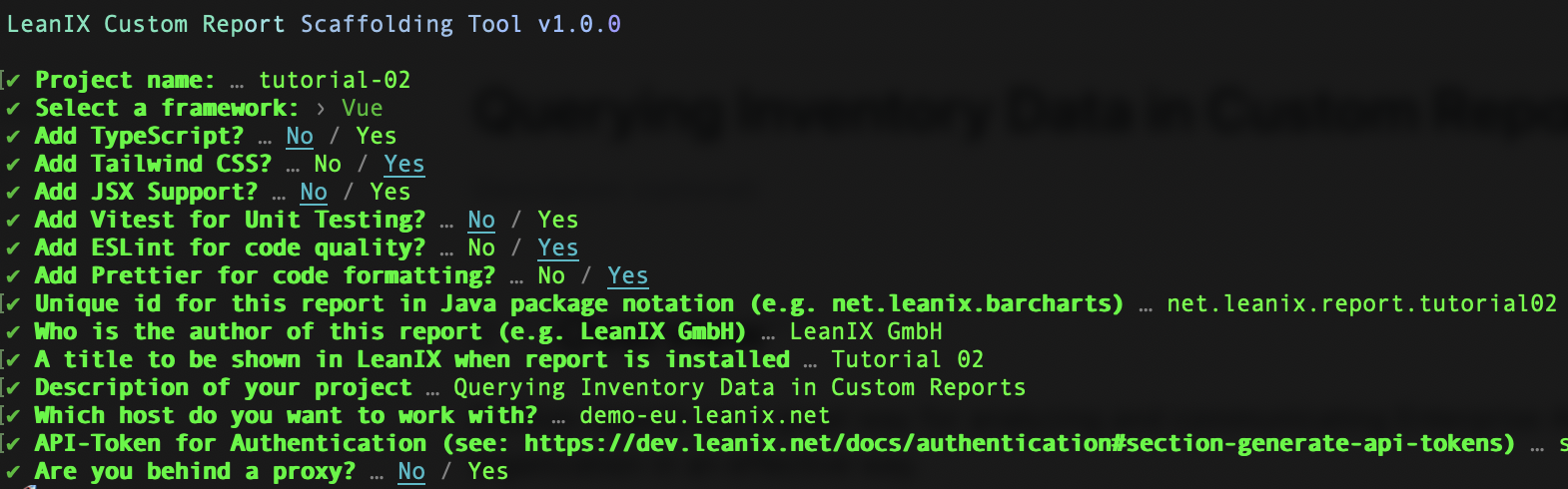
Initialize a new project by running the following command and answering the questionnaire. For this tutorial we will be using the vue template:
npm init lxr@latest
Answer the questionnaire as follows, making sure you answer the last three questions with the appropriate values for your workspace and network:
After this procedure, you should end up with the following project structure:

Finally, before proceeding, we'll delete the ./src/components/HelloWorld.vue file and edit the ./src/App.vue file as follows:
<template>
  <!-- we'll use this template tag for declaring our custom report html -->
  <div>Hi from LeanIX Custom Report</div>
</template>

<script setup>
  // all the state variables and business logic will be declared here
</script>
You may now start the development server now by running the following command:
npm run dev
Note!
When you run npm run dev, a local webserver is hosted on localhost:3000 that allows connections via HTTPS. But since just a development SSL certificate is created the browser might show a warning that the connection is not secure. You could either allow connections to this host anyways, or create your own self-signed certificate.
If you decide to add a security exception to your localhost, make sure you open a second browser tab and point it to https://localhost:3000. Once the security exception is added to your browser, reload the original url of your development server and open the development console. Your should see a screen similar to the one below:

Nothing very exciting happens here. Notice however that our report loads, and is showing the message we defined inside the template tag of the App.vue file.
Report design
In our report we want to analyze the average completion ratio for a specific factsheet type, configurable by the user. In order to do so, we'll use the lx.openFormModal method of the leanix-reporting api. For the rest of this tutorial, we'll divide our report implementation into three parts: setting up the report configuration workflow, querying workspace data and visualizing the results.
Setting up the Report Configuration
To allow the user to select the factsheet type to be analyzed by the report. For that, the standard "Settings" button can be enabled by the showConfigure flag in the report configuration. This "Settings" button will trigger a callback that opens a modal containing a dropdown list of all factsheet types available in the workspace.
We edit the src/App.vue file and declare in the script section the following two state variables: factSheetTypes and selectedFactSheetType, and two methods: initializeReport and openReportConfigurationModal:
<script setup>
import '@leanix/reporting'
import { ref, watch } from 'vue'

// reactive variable that will hold the workspace factsheet types
const factSheetTypes = ref([])
// reactive variable will hold the selected factsheet type
const selectedFactSheetType = ref(null)

// we define our report initialization method, it is an async one so that we
// can syncronously await for Promise results
const initializeReport = async () => {
  const setup = await lx.init()
  // we extract here the list of all factsheet types available in the workspace and store it
  factSheetTypes.value = Object.keys(setup.settings.dataModel.factSheets)
  // and select the first factsheet type of that list
  selectedFactSheetType.value = factSheetTypes.value?.[0] || null
  const config = {
    menuActions: {
      // we enable here the standard "Settings" button
      showConfigure: true,
      // and set the callback for opening the configuration modal defined ahead
      configureCallback: openReportConfigurationModal
    }
  }
  // we configure our custom report with an empty configuration object
  return lx.ready(config)
}

// method for opening up the configuration modal and show a single select input containing the list of available factsheet types
const openReportConfigurationModal = async () => {
  const fields = {
    factSheetType: {
      type: 'SingleSelect',
      label: 'FactSheet Type',
      options: factSheetTypes.value
        .map(factSheetType => ({
          value: factSheetType,
          label: lx.translateFactSheetType(factSheetType)
        })
        )
    }
  }
  const initialValues = { factSheetType: selectedFactSheetType.value }
  const values = await lx.openFormModal(fields, initialValues)
  if (values) selectedFactSheetType.value = values.factSheetType
}

// we call our report initialization method here...
initializeReport()
</script>

<template>
  <div class="container mx-auto h-screen">
    <div>{{selectedFactSheetType}}</div>
  </div>
</template>
Notice now that the Settings button appears on the top-right corner of the report, and that when clicking on it the report configuration modal shows up. Confirm that when selecting a different factsheet type, the placeholder element, situated on the top-left corner of the report, gets updated accordingly.

So now that we have our configuration workflow in place, let's proceed with the data querying and visualization part!
Querying the Workspace Data
Having the report configuration workflow in place, it's time to implement the data querying mechanism for fetching data from the workspace. For each selected factsheet type, the goal is to compute a factsheet type average completion ratio defined as the sum of all factsheets completion ratios divided by the number of factsheets. We'll add to the script section of our src/App.vue file a state variable averageCompletion, a method fetchGraphQLData and a watcher for the selectedFactSheetType state variable:
<script setup>
import '@leanix/reporting'
import { ref, watch } from 'vue'

const factSheetTypes = ref([])
const selectedFactSheetType = ref(null)

// reactive variable that will hold the computed averageCompletion statistic
const averageCompletion = ref(null)

const initializeReport = async () => { /* nothing changes here... */ }

const openReportConfigurationModal = async () => { /* nothing changes here... */ }

// method that will query the workspace for the completion value of the selectedFactSheetType
const fetchGraphQLData = async () => {
  const query = 'query($factSheetType:FactSheetType){allFactSheets(factSheetType:$factSheetType){edges{node{completion{completion}}}}}'
    try {
    lx.showSpinner()
    averageCompletion.value = await lx.executeGraphQL(query, { factSheetType: selectedFactSheetType.value })
      .then(({ allFactSheets }) => {
        const completionSum = allFactSheets.edges.reduce((accumulator, { node }) =>  accumulator += node.completion.completion, 0)
        const factSheetCount = allFactSheets.edges.length
        const averageCompletion = completionSum / factSheetCount
        return averageCompletion
      })
  } finally {
    lx.hideSpinner()
  }
}

// watcher that will trigger the fetchGraphQLData on every selectedFactSheetType update
watch(selectedFactSheetType, fetchGraphQLData)

// we call our report initialization method here...
initializeReport()
</script>
We'll also adjust the template section of our src/App.vue file as follows:
<template>
  <div class="container mx-auto h-screen">
    <div>{{selectedFactSheetType}} avg completion = {{(averageCompletion * 100).toFixed(0)}}%</div>
  </div>
</template>
Launching the report and switching between factsheet types, verify that the average completion percentage, shown on the top-left corner of the report, gets updated accordingly.

Now that we have the data querying mechanism for our report in place, lets proceed to the data visualization part!
Visualizing the Results
For the last part of this tutorial, we'll use the Chart.JS to display the average completion ratio as an half-pie chart.
We'll start by installing the following dependencies to our project:
npm install chart.js tinygradient
We start by editing the script section of our src/App.vue file and add the Chart.js and tinygradient dependencies to our code. We declare as well the chart and chartCanvas variables and the updateChart method. As we want to change the chart color according the completeness ratio, we build a linear color gradient using the tinygradient library. In our example, we'll be using a single dataset composed by two data points with the values of the average completeness ratio (corresponding to the colored bar of the chart) and the 1-complement value of this average (corresponding to the faded-gray bar). More details on the ChartJS api can be found on the documentation. Finally, we add also a watcher for the averageCompletion variable which will trigger the updateChart method on every update.
<script setup>
import '@leanix/reporting'
import { ref, watch, computed } from 'vue'
// Chart.js dependency
import Chart from 'chart.js/auto'
// tinygradient dependency
import tinygradient from 'tinygradient'

const factSheetTypes = ref([])
const selectedFactSheetType = ref(null)
const averageCompletion = ref(null)

// holder variable for our chart (non-reactive)
let chart

// reactive holder for our canvas element
const chartCanvas = ref(null)

const initializeReport = async () => { /* nothing changes here */ }

const openReportConfigurationModal = async () => { /* nothing changes here */ }

const fetchGraphQLData = async () => { /* nothing changes here */ }

// Our method for updating the chart
const updateChart = () => {
  const gradient = tinygradient([
    { color: 'red', pos: 0 },
    { color: 'yellow', pos: 0.3 },
    { color: 'green', pos: 1 }
  ])
  const data = [averageCompletion.value, 1 - averageCompletion.value]
  const backgroundColor = [gradient.rgbAt(averageCompletion.value).toHexString(), 'rgba(0, 0, 0, 0.1)']
  if (typeof chart === 'undefined') {
    const config = {
      type: 'doughnut',
      data: { datasets: [{ data, backgroundColor }] },
      options: {
        circumference: 180,
        rotation: -90,
        tooltips: { enabled: false },
        hover: { mode: null }
      }
    }
    const ctx = chartCanvas.value.getContext('2d')
    chart = new Chart(ctx, config)
  } else {
    chart.data.datasets[0] = { data, backgroundColor }
    chart.update()
  }
}

// computed variable for translating the selected factsheet type
const factSheetTypeLabel = computed(() => selectedFactSheetType.value !== null
  ? lx.translateFactSheetType(selectedFactSheetType.value, 'plural')
  : null)

watch(selectedFactSheetType, fetchGraphQLData)
// watcher that will trigger the updateChart method on every averageCompletion variable update
watch(averageCompletion, updateChart)

initializeReport()
</script>
We edit the template section of our src/App.vue file and add a div container element for holding the chart canvas, title, subtitle and legend, as below:
<template>
  <div class="container mx-auto text-md text-gray-800">
    <!-- chart container -->
    <div class="relative flex flex-col flex-wrap items-center mt-16 -mx-8 mt-16">
      <!-- chart title -->
      <div class="text-4xl mb-2">Average Completion Ratio for</div>
      <!-- chart subtitle -->
      <div class="text-6xl font-bold">
        {{factSheetTypeLabel}}
      </div>
      <!-- chart legend -->
      <div class="absolute bottom-12 font-bold text-4xl">
        {{(averageCompletion * 100).toFixed(0)}}%
      </div>
      <!-- canvas container -->
      <div>
        <canvas ref="chartCanvas"/>
      </div>
    </div>
  </div>
</template>
Now just run npm run dev to launch the development server again and observe your report chart updating while you switch between factsheet types in the Settings menu.

Congratulations, you have finalized this tutorial!
Here is the complete codebase from src/App.vue for your reference:
<script setup>
import '@leanix/reporting'
import { ref, watch, computed } from 'vue'
// Chart.js dependency
import Chart from 'chart.js/auto'
// tinygradient dependency
import tinygradient from 'tinygradient'

// reactive variable that will hold the workspace factsheet types
const factSheetTypes = ref([])
// reactive variable will hold the selected factsheet type
const selectedFactSheetType = ref(null)
// reactive variable that will hold the computed averageCompletion statistic
const averageCompletion = ref(null)

// holder variable for our chart (non-reactive)
let chart

// reactive holder for our canvas element
const chartCanvas = ref(null)

// we define our report initialization method, it is an async one so that we
// can syncronously await for Promise results
const initializeReport = async () => {
  const setup = await lx.init()
  // we extract here the list of all factsheet types available in the workspace and store it
  factSheetTypes.value = Object.keys(setup.settings.dataModel.factSheets)
  // and select the first factsheet type of that list
  selectedFactSheetType.value = factSheetTypes.value?.[0] || null
  const config = {
    menuActions: {
      // we enable here the standard "Settings" button
      showConfigure: true,
      // and set the callback for opening the configuration modal defined ahead
      configureCallback: openReportConfigurationModal
    }
  }
  // we configure our custom report with an empty configuration object
  return lx.ready(config)
}

// method for opening up the configuration modal and show a single select input containing the list of available factsheet types
const openReportConfigurationModal = async () => {
  const fields = {
    factSheetType: {
      type: 'SingleSelect',
      label: 'FactSheet Type',
      options: factSheetTypes.value
        .map(factSheetType => ({
          value: factSheetType,
          label: lx.translateFactSheetType(factSheetType)
        })
        )
    }
  }
  const initialValues = { factSheetType: selectedFactSheetType.value }
  const values = await lx.openFormModal(fields, initialValues)
  if (values) selectedFactSheetType.value = values.factSheetType
}

// method that will query the workspace for the completion value of the selectedFactSheetType
const fetchGraphQLData = async () => {
  const query = 'query($factSheetType:FactSheetType){allFactSheets(factSheetType:$factSheetType){edges{node{completion{completion}}}}}'
    try {
    lx.showSpinner()
    averageCompletion.value = await lx.executeGraphQL(query, { factSheetType: selectedFactSheetType.value })
      .then(({ allFactSheets }) => {
        const completionSum = allFactSheets.edges.reduce((accumulator, { node }) =>  accumulator += node.completion.completion, 0)
        const factSheetCount = allFactSheets.edges.length
        const averageCompletion = completionSum / factSheetCount
        return averageCompletion
      })
  } finally {
    lx.hideSpinner()
  }
}

// Our method for updating the chart
const updateChart = () => {
  const gradient = tinygradient([
    { color: 'red', pos: 0 },
    { color: 'yellow', pos: 0.3 },
    { color: 'green', pos: 1 }
  ])
  const data = [averageCompletion.value, 1 - averageCompletion.value]
  const backgroundColor = [gradient.rgbAt(averageCompletion.value).toHexString(), 'rgba(0, 0, 0, 0.1)']
  if (typeof chart === 'undefined') {
    const config = {
      type: 'doughnut',
      data: { datasets: [{ data, backgroundColor }] },
      options: {
        circumference: 180,
        rotation: -90,
        tooltips: { enabled: false },
        hover: { mode: null }
      }
    }
    const ctx = chartCanvas.value.getContext('2d')
    chart = new Chart(ctx, config)
  } else {
    chart.data.datasets[0] = { data, backgroundColor }
    chart.update()
  }
}

// computed variable for translating the selected factsheet type
const factSheetTypeLabel = computed(() => selectedFactSheetType.value !== null
  ? lx.translateFactSheetType(selectedFactSheetType.value, 'plural')
  : null)

// watcher that will trigger the fetchGraphQLData on every selectedFactSheetType update
watch(selectedFactSheetType, fetchGraphQLData)

// watcher that will trigger the updateChart method on every averageCompletion variable update
watch(averageCompletion, updateChart)

// we call our report initialization method here...
initializeReport()
</script>

<template>
  <div class="container mx-auto text-md text-gray-800">
    <!-- chart container -->
    <div class="relative flex flex-col flex-wrap items-center mt-16 -mx-8 mt-16">
      <!-- chart title -->
      <div class="text-4xl mb-2">Average Completion Ratio for</div>
      <!-- chart subtitle -->
      <div class="text-6xl font-bold">
        {{factSheetTypeLabel}}
      </div>
      <!-- chart legend -->
      <div class="absolute bottom-12 font-bold text-4xl">
        {{(averageCompletion * 100).toFixed(0)}}%
      </div>
      <!-- canvas container -->
      <div>
        <canvas ref="chartCanvas"/>
      </div>
    </div>
  </div>
</template>
Updated over 1 year ago